Using the Scheduling Grids |

|

|

|
|
Using the Scheduling Grids |

|

|

|
|
|
||
To access the grids, click on the Scheduling Grids option from the Calendars tab. Access to this option is granted within a user's role. A default grid will be displayed as defined by the calendar permission within your role. The default filter is determined by the grid definition.
If more than one Scheduling Grid is available to you, you may choose between different options using the Choose Calendar drop-down menu. Upon selecting a new saved grid, the display will refresh with that grid's default view and filter applied.

Pre-defined filters can be associated with saved grids. If the selected grid includes pre-defined filters, you may choose between the saved filters using the Filter drop-down menu. Upon selecting a filter, the contents of the grid being viewed will update accordingly.

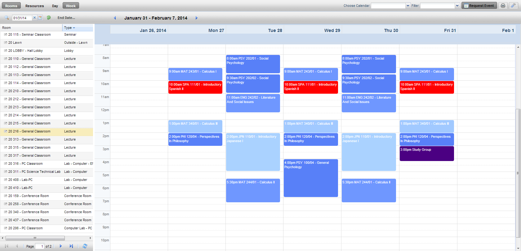
A user may choose to view either the Day or Week grid format, and navigate through a list of either rooms or resources. The list of rooms or resources is presented on the left, and activities using the applicable room or resource will appear as shaded cells in the grid to the right.
The grid toolbar, shown below, can be used to edit the date, filters, format, and settings of the grids.

Paging controls, provided at the bottom of the screen, can be used to navigate pages, set page size, and export results.

The Day view of the Grid displays each item’s schedule on a single row. This view provides immediate feedback on availability and usage for a single day, across a page full of rooms at a time.

Introduced in release 7.5.12, overlapping activities are displayed with a dog ear at the corner to indicate that there is another activity to view. If a dog ear is displayed, hover over the icon and click to send the currently displayed activity to the back. The other activity will be displayed in front, as shown below.

![]()
The Week view of the grid requires that you select the room or resource you would like to view from the list on the left. This view provides immediate feedback on availability and usage for a full week (or date range - see below) at once.

Additionally, the Week view includes a feature that allows you to specify a date range. When viewing a date range instead of a single week, all activities that occur during the entire range will be shown together. This feature is useful when searching for an available time slot for a recurring activity.
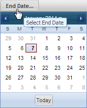
To specify a date range while in Week view, click the "End Date..." option to the right of the date selector.

When an end date is selected, the grid will refresh, and the selected date will be displayed to indicate that you are viewing a date range.
![]()
Click the X to remove the end date and return to standard week behavior.
![]() NOTE: Keep in mind that when using the date range feature of the weekly grid, the dates displayed for the week represent the first week in your range.
NOTE: Keep in mind that when using the date range feature of the weekly grid, the dates displayed for the week represent the first week in your range.
In both the Day and Week format, a list of rooms or resources is displayed on the left. In Day format, each row represents that item's schedule (based on filter settings) for the date selected. In Week format, you must click a room or resource on the list to view its weekly schedule.
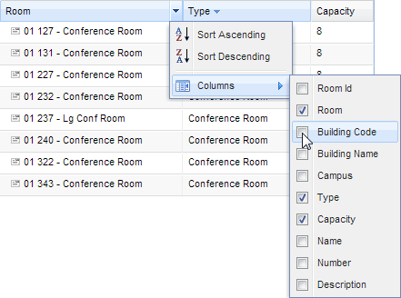
You may add, remove, resize, and reorder columns in the room and resource panel as desired. To add or remove columns, click the down arrow to the right of any column in the panel and then choose "Columns" to see the list of available columns. Either add or remove check marks to add and remove columns from the panel.

To resize columns, hover your cursor over the line to the right of the column you wish to resize and then click and drag right or left.

To reorder columns, click in the header of the column you with to move and then drag it to another position. Release the column when the position arrows are in the desired location.
